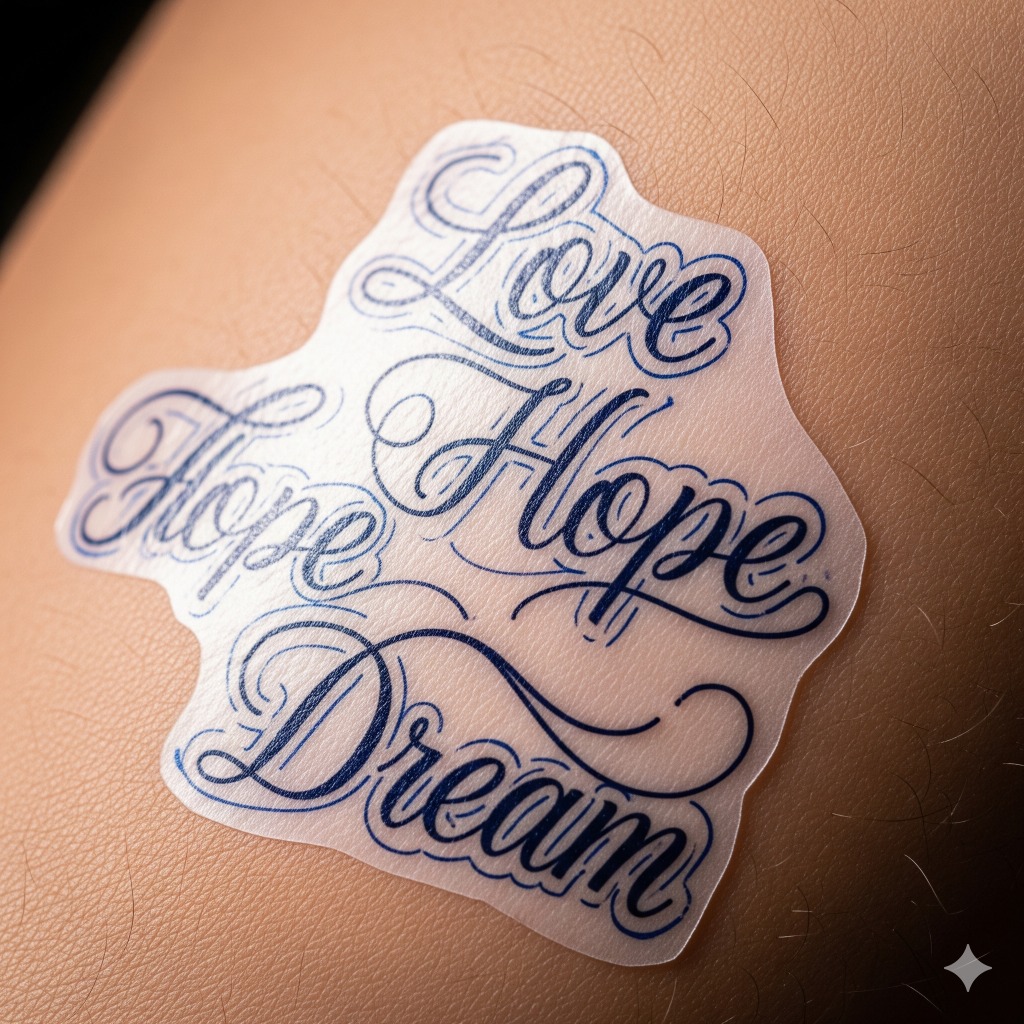
Tattoos are like stories we wear on our skin, and lettering script tattoo design banners are the perfect way to shout our tales with style. Whether it’s a favorite quote or a secret motto, these flowing scripts wrapped in banners add a dash of flair that says, “Hey world, this is me!” without us having to actually say anything.
Materials and Tools Needed for Lettering Script Tattoo Design Banners
Starting the perfect lettering script tattoo banner demands the right gear. Let’s break down what powers our creative journey.
Essential Drawing Tools
Pencils 2B and 4B sharpen every detail for smooth flowing lines and bold shadows. Ink pens sized 0.1mm to 0.5mm provide crisp outlines that pop on skin and paper. Erasers kneaded and rubbered erase mistakes without leaving scars on the sketch. Rulers and French curves shape flawless banners with sleek curves or sharp edges. Sketch paper’s smooth texture holds ink well and withstands erasing repeated times.
Digital Design Software Options
Adobe Illustrator shines for vector precision shaping every banner fold and swirl. Procreate’s brush library matches hand-drawn textures with digital ease on iPads. CorelDRAW balances power with simplicity for lettering scripts, offering layering and color control. Free options like Inkscape handle vector graphics well if budget refuses cooperation.
Reference Materials and Typography Guides
Typography books like “The Art of Hand Lettering” unlock secrets behind elegant curves and spacing rules. Calligraphy alphabet sheets show letter formations in various scripts such as Copperplate or Gothic. Tattoo portfolio collections inspire banner styles proven to withstand time and trends. Online resources including Behance and Pinterest supply daily doses of design gold.
Planning Your Lettering Script Tattoo Design Banner
Planning a lettering script tattoo banner combines thoughtful design choices with a splash of personality. Focusing on script style, banner shapes, and symbols ensures the banner speaks louder than a megaphone at a mime convention.
Choosing the Right Script Style
Select a script style that matches the vibe of your message. Cursive styles like Spencerian or Copperplate offer elegance, while brush scripts add casual flair. Remember to weigh readability since fancy loops can turn your message into ancient hieroglyphics. Sketch at least three styles, then pick the one that balances style and clarity without making your tattoo look like a secret code.
Selecting Banner Shapes and Layouts
Pick banner shapes that frame the text without swallowing it whole. Straight banners work for straightforward messages; curved or wavy banners inject dynamic movement. Consider layouts like single-line wraps, stacked text blocks, or ribbons twisting around other elements. Design at least two options digitally or on paper, and visualize how they flow with your body’s contours. Avoid shapes that block joint movement or look like limp noodles.
Incorporating Personal Meaning and Symbols
Embed symbols and elements that elevate your message beyond letters. Hearts, stars, or arrows can add emotional depth or direction. Use icons relevant to your story, such as a compass for guidance or a clock for time’s significance. Place these thoughtfully so they enhance rather than compete with the script. We advise testing placements by printing small mock-ups on your skin or using temporary tattoos to avoid surprises at the needle.
Step-by-Step Guide to Creating Lettering Script Tattoo Design Banners
Mastering the art of lettering script tattoo design banners requires a clear stepwise approach. Let’s break it down while keeping it fun and creative.
Sketching the Basic Banner Shape
Start with a simple light pencil outline to capture the banner’s core shape. Use gentle curves or sharp edges depending on whether we want a flowing ribbon or a bold flag vibe. Measure twice since repositioning that banner on paper beats fixing it on skin—no eraser can undo tattoo regret. Draw parallel lines about 0.5 to 1 inch apart for the banner’s width and decide on banner tails or folds early to avoid awkward twists. Keep proportions consistent to match the body contour where the tattoo sits.
Designing the Lettering Script
Pick a script style that blends personality with readability. Use flourished cursive for elegance or chunky handwritten styles for bold statements. Draft letters separately with a 2 to 3 mm gap for clarity, then tighten spacing only if the message demands compactness. Experiment with uppercase accents for emphasis but avoid turning the entire phrase into shouty caps unless shouting was the message. Refer to typography guides to maintain stroke consistency and smooth joins that flow naturally.
Integrating Lettering with the Banner Design
Fit the lettering snug inside the banner shape while avoiding crowding. Adjust letter size so it fills roughly 70 to 80 percent of the banner’s height to prevent squishing or oversized gaps. Let tails or descenders dip gracefully beyond the banner’s bottom line only if it enhances the overall elegance. Use light construction lines to curve text along banner folds or edges so it looks painted, not pasted. Erase excess sketch lines to keep the design crisp.
Adding Decorative Elements and Flourishes
Sprinkle small flourishes like swirly ends, dots, or mini stars to jazz up corners and banner tails without overcrowding. Balance complexity by limiting decoration to 2 or 3 spots to avoid turning art into a scribble fest. Incorporate personal symbols subtly behind or beside the banner to add uniqueness—think tiny hearts, arrows, or anchors sized 0.3 to 0.5 inches. Keep line thickness for decorations consistent with lettering to maintain harmony throughout the tattoo design.
Techniques for Refining Your Design
Refining the lettering script tattoo banner brings sharpness and personality. Let’s sharpen those pencils and level up our designs with these essential techniques.
Line Weight and Shading Tips
Vary line weights for depth and emphasis. Thicken main strokes to anchor letters, thin secondary strokes for flair. Apply gentle shading inside banner folds or behind letters to simulate shadows without turning the design into a fog machine. Maintain consistent light source direction; otherwise, your banner may look like it just survived a haunted house tour. Remember, subtle gradients enhance readability and style without stealing the spotlight from the script.
Balancing Text and Banner Proportions
Match text size to banner dimensions like a dance partner coordinating moves. Oversized letters spill out of banners looking like they didn’t get the memo; undersized text disappears, leaving banner space screaming for attention. Leave enough breathing room around letters for clarity, especially along curved banner edges where distortion wants to crash the party. Adjust banner curves to hug the script naturally, folding just enough to show off without suffocating.
Using Color and Contrast Effectively
Choose colors for contrast that pop and play well together. Light ink on a dark banner or vice versa avoids the dreaded “Where’s the tattoo?” effect. Limit the palette to two or three colors to keep the design from auditioning for a circus act. Use muted hues for vintage vibes or bold ones for bragging rights on legibility. Adding a subtle outline or drop shadow around letters brightens their stage presence and prevents color clashes from turning the tattoo into a Rorschach test.
Transferring Your Design to Tattoo Stencil
Turning our perfected lettering script banner into a tattoo stencil demands precision and care to keep every swirl and curve crisp. This step bridges our artwork and the skin canvas.
Preparing the Final Design for Tattooing
We finalize the design by converting digital or hand-drawn art into a high-contrast black and white image. Trim any unnecessary shading and keep outlines sharp to ensure easy tracing. Scaling the design to match the exact tattoo size on the body part prevents resizing hiccups later. Print the design on special thermal stencil paper or use a stencil transfer pen to hand-draw over tracing paper. Avoid smudges by letting ink dry completely before moving on to the next step.
Tips for Clear and Accurate Stencils
We apply stencil transfer gel evenly on clean skin to guarantee the stencil sticks without warping. Press the stencil firmly and hold steady until it fully adheres, preventing ghosted or faded lines. If the design contains delicate script or thin banner lines, reinforce edges by running over them with a fine liner pen on the stencil before transfer. Always test the stencil on a small skin patch to check clarity for the tattoo artist. Clear stencils make all the difference between a legendary ink job and a “what happened there?” moment.
Common Mistakes to Avoid in Lettering Script Tattoo Design Banners
Avoiding pitfalls in lettering script tattoo design banners saves time and preserves sanity. Let’s dissect the most notorious blunders.
Overcomplicating the Script or Banner
Overloading a banner with intricate curls and swirls confuses the eye. Using excessively elaborate scripts that mimic a spaghetti plate guarantees misinterpretation. Applying too many decorative elements in tight spaces causes design suffocation. Keeping lettering crisp and banners simple maintains elegance without chaos. Choosing one or two flourishes per word balances style and clarity. Overdoing flair risks turning a meaningful message into hieroglyphics.
Ignoring Readability and Placement
Disregarding readability renders tattoos into mysterious cryptograms. Adopting script styles too fancy or tiny for the skin size ensures frustration for tattoo wearers and viewers alike. Placing banners on curved or uneven body parts without adjusting the design causes text distortion or awkward wrapping. Prioritizing readability by selecting clear scripts and considering body contours promises a design that pops. Neglecting these factors delivers tattoos that, instead of wow-ing crowds, require guesswork and squinting.
Troubleshooting and Adjustments
Mastering lettering script tattoo design banners means tackling hiccups and fine-tuning details. Below are hacks for fixing common issues in proportions and adapting designs to various body areas.
Fixing Lettering Proportions
Aligning lettering proportions creates harmony between text and banner. Adjust letter height and width if letters look squished or stretched. Redraw letters with consistent stroke thickness so no one looks like it overdid the gym or skipped leg day. Increase spacing between letters (kerning) if the words resemble a scribble festival; tighten spacing when letters act like loners. Scale letters so they fill the banner equally without bumping into edges or crowding. Sketch several versions, then pick the one that reads like a polite RSVP rather than a mystery novel.
Adapting Designs for Different Body Areas
Matching the script banner to body curves keeps tattoos looking sharp not lopsided. Wrap banners more around round areas like shoulders or calves ensuring script follows the natural flow and avoids awkward bends. Flatten or elongate banners on flatter areas like forearms or shins to prevent distortion when skin stretches or moves. Resize designs larger for bustling busy areas like hands or wrists to maintain detail clarity; shrink designs for discreet spots like behind the ear. Test mock-ups on the exact spot using temporary tattoos or tracing paper if we want confidence without surprises.
Conclusion
Lettering script tattoo banners aren’t just ink on skin—they’re our personal billboards, shouting out who we are without saying a word. Getting the design just right takes some elbow grease, a dash of creativity, and maybe a few eraser shavings (or digital undo clicks).
But hey, once you nail that perfect script wrapped in a banner that hugs your body like a tailored suit, you’re set to wear your story loud and proud. So let’s keep those designs clear, stylish, and uniquely ours—because life’s too short for boring tattoos or squiggly scripts nobody can read.
Frequently Asked Questions
What makes lettering script tattoo banners special?
Lettering script tattoo banners combine stylish text with banner shapes to creatively display personal messages, quotes, or mottos. They add visual interest while highlighting identity through elegant and readable script designs.
What tools are needed to design a lettering script tattoo banner?
You need drawing tools like pencils, ink pens, erasers, rulers, sketch paper, and digital design software such as Adobe Illustrator or Procreate. Reference materials and typography guides also help inspire and guide your design.
How do I choose the right script style for my tattoo banner?
Pick a script style that matches your message’s tone—whether elegant, bold, or casual—while ensuring the text is readable and fits the banner’s shape and your body’s natural contours.
What is the best way to plan a tattoo banner design?
Start with a rough sketch considering banner shape, text placement, and your body’s contours. Add personal symbols for flair and test the layout on your skin with temporary tattoos or mock-ups before finalizing.
How do I integrate lettering with banner design effectively?
Design the lettering to fit neatly within the banner without overcrowding. Maintain consistent spacing and stroke weight, ensuring a balanced look that supports both readability and style.
What techniques improve the depth and clarity of the tattoo design?
Vary line weights to emphasize key parts, use gentle shading to create depth, and apply contrasting colors or outlines sparingly for better legibility while keeping the design balanced.
How do I prepare the tattoo stencil from the final design?
Convert your design to a high-contrast black and white image. Scale it to fit the intended body area accurately, use stencil transfer gel for clear application, and test the stencil on a small skin patch.
What common mistakes should I avoid in lettering script banner tattoos?
Avoid overly complex scripts and excessive decorations that reduce readability. Also, ensure proper size and placement, considering body curves to avoid distorted or unclear text.
How can I fix issues with lettering proportions in my design?
Adjust letter height and width for balance, manage spacing between letters to avoid crowding or gaps, and reshape the banner as needed to make the text fill the space harmoniously.
How do I adapt a tattoo banner design for different body parts?
Match the banner shape to your body’s curves for a natural fit. Test designs on the intended area with mock-ups or temporary tattoos to ensure the final tattoo looks sharp and well-placed.