Lettering Script Tattoos are like wearable art, but not all lines are created equal. Ever seen a tattoo that looks like a tangled mess of spaghetti? Yeah, us too. It turns out that the thickness of those lines—what pros call “line weights”—can make or break a design’s readability.
We’re diving into why some tattoos scream “masterpiece” while others whisper “what was I thinking?” It’s all about finding that sweet spot between bold and delicate so your ink stays sharp and legible, even after years of showing off your epic story. Let’s unravel the mystery behind those lines and make sure your next tattoo doesn’t just look good up close but stays clear from across the room.
Materials and Tools for Tattoo Line Work
Choosing the right materials and tools powers precise line weights and sharp readability in tattoo design. Let’s gear up with essentials that keep our lines bold, fine, or somewhere perfectly in between.
Essential Tattooing Equipment
Every sharp line depends on reliable equipment.
- Tattoo machine: Rotary or coil options deliver different performances. Rotary machines excel at smooth lines but coil machines offer more punch for thick outlines.
- Power supply and foot pedal: Consistent power maintains steady needle speed. Unsteady voltage makes lines wobble like a caffeine-fueled squirrel.
- Grip and tube: Comfortable grips stabilize our hands for fine control. Lightweight materials reduce fatigue across long sessions.
- Stencil supplies: Transfer paper, stencil solution, and applicators ensure crisp outlines to trace. Blurry stencils sabotage line precision before the needle even touches skin.
- Cleaning supplies: Autoclaves, disinfectants, and barrier films keep tools sterile. Clean equipment lets us focus on line clarity instead of hospital visits.
Recommended Inks and Needles for Different Line Weights
Line weights demand matching inks and needles to stay readable and fresh-looking.
| Line Weight Type | Needle Configuration | Ink Type | Description |
|---|---|---|---|
| Fine Lines | Single needle (1RL) | Black or colored liner ink | Ultra-fine lines need sharp single needles for crisp detail without bleeding. |
| Medium Lines | 3-5 round liner needles (3RL, 5RL) | Standard liner ink | Balanced size gives boldness without overpowering delicate details. |
| Bold Lines | 7-9 round liner needles (7RL, 9RL) | Heavier pigmented black ink | Thick lines require more needles for saturation and inks designed to resist fading and spreading. |
Reliable inks hold pigments tightly and age gracefully. Runny or diluted inks cause smudgy results that erase our hard-earned line art. We select inks with strong pigment profiles backed by reputable manufacturers.
Fine-tuning needle choice with matching ink ensures optimal flow, saturation, and longevity. Mixing and matching blindly creates tattoos that look like abstract kitchen mishaps—a high-stakes mess nobody wants.
Understanding Line Weights in Tattoo Design
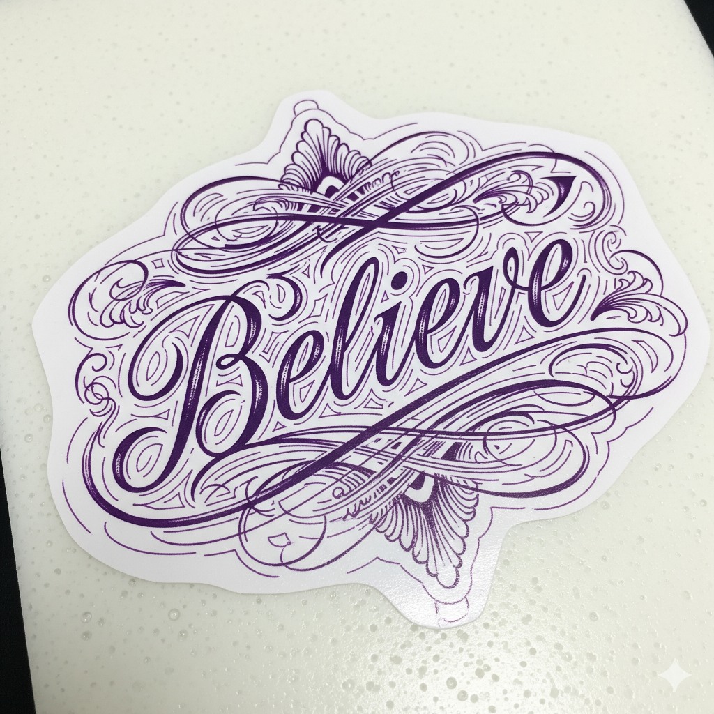
Line weights shape tattoo design by defining edges, adding detail, and influencing overall readability. Mastering thin, medium, and thick lines creates tattoos that stay sharp and eye-catching.
Types of Line Weights (Thin, Medium, Thick)
- Thin lines deliver intricate detail and delicate accents but risk fading quickly if applied too fine.
- Medium lines provide versatile balance for outlining and shading, holding well over years.
- Thick lines ensure bold outlines that resist blurring and ink spreading, making tattoos pop from a distance.
How Line Weights Affect Tattoo Visibility and Longevity
- Visibility improves with thicker lines since skin aging blurs finer details, reducing readability.
- Longevity depends on thickness; thin lines fade or blur faster, compromising design clarity.
- Line weight interacts with placement; areas with high skin movement or sun exposure benefit from medium to thick lines.
Balancing Line Weights for Aesthetic Appeal
- Varying line weights enrich designs by creating depth and guiding the viewer’s eye.
- Employ thick lines for main outlines and medium lines for mid-detail to preserve structure.
- Reserve thin lines for subtle textures and highlights; overuse risks muddling the tattoo’s clarity.
Techniques for Achieving Optimal Line Weights
Mastering line weights demands precision and technique. Employing the right needle, tweaking machine settings, and exploring traditional methods ensures every line stays sharp and readable.
Using Different Needle Configurations
Choosing needles from single liners to tight groupings shapes line thickness. Single needles produce crisp thin lines perfect for delicate details. Tight round liners with 3 to 7 needles form medium lines that balance clarity and durability. Magnums or larger round liners, packing 9 or more needles, generate bold lines that stand strong over decades. Experimenting with needle stacking and grouping enables subtle gradations in thickness without sacrificing line integrity.
Adjusting Machine Settings for Line Variation
Tweaking our tattoo machine’s voltage alters needle speed influencing line weight. Lower voltage slows needle movement laying down thicker ink lines while higher voltage speeds up for finer lines. Adjusting needle depth also changes thickness; shallowly piercing skin yields lighter lines, deeper penetration enhances boldness but risks blowouts. Balancing speed and depth keeps lines crisp and consistent, avoiding those dreaded blurs that scream “ouch” instead of “art”.
Hand-Poking and Traditional Methods
Hand-poking offers unique control over line weight by manual pressure and rhythm. Slow steady pokes deliver thin, precise lines while firmer pushes thicken strokes with charming imperfection. Traditional stick-and-poke techniques embrace this variability, perfect for minimalist and tribal designs. Using this method connects us to tattoo history and skips all those complicated machine settings—plus it’s oddly satisfying to do.
Enhancing Readability Through Line Weights
Delivering clear and readable tattoos depends heavily on the strategic use of line weights. Understanding how skin type, placement, and design choices impact line clarity helps us craft tattoos that stand out and age gracefully.
Designing for Skin Type and Placement
Recognizing skin texture influences line visibility and sharpness. We use thicker lines on oily or coarse skin because thin lines tend to blur faster there. We select medium lines for normal skin types to balance detail and durability. We avoid ultra-thin lines on high-movement areas like elbows or fingers since constant flexing causes faster fading.
Placement also dictates line weight choices. We prefer bold outlines on sun-exposed locations to counteract fading caused by UV rays. We favor finer lines on areas with less sun exposure and lower friction like the upper arm or back. Our design strategies adapt line weights to natural skin variations and lifestyle factors to keep tattoos crisp longer.
Incorporating Negative Space for Clear Definition
Employing negative space improves tattoo definition and prevents visual clutter. We create breathing room by balancing thick and thin lines around empty spaces, enabling the skin to highlight shapes and details naturally. Larger negative spaces act as visual anchors that separate and emphasize complex line work.
We intersperse negative space strategically in areas dense with lines—like floral patterns or mandalas—to make individual elements pop. When negative space and line weights work together, tattoos maintain high readability and avoid morphing into a blob of ink over time.
Avoiding Common Line Weight Mistakes
Mistaking uniform line weights for consistency dulls tattoo readability. We dodge applying the same thickness everywhere because it flattens the design and reduces dimension. Overusing thin lines on high-traffic skin guarantees a blurry mess sooner than later.
We steer clear of excessive line weight contrast that confuses the eye, for example, combining ultra-bold outlines with hairline details in a tiny tattoo. Calibrating needle size and machine speed to match the intended line weight prevents uneven strokes or blowouts.
Ignoring skin type or placement when planning line weights often leads to premature fading. We prioritize line weight variation with purpose making tattoos that laugh in the face of time and daily wear.
Stages of Tattoo Creation Related to Line Weights
Mastering line weights takes shape through distinct tattoo creation stages. Each stage sharpens the clarity and character of our design’s lines.
Sketching and Conceptualizing Line Weight Variations
Beginning with sketching injects life into line weight choices. We draft multiple versions exploring thin, medium, and thick lines to highlight depth and detail. Using varied line weights here guides final readability and ensures that bold outlines command attention while delicate lines whisper subtle secrets. Sketches act as our playground to experiment and prevent tattoos from turning into line mush.
Transferring the Design to Skin
Next comes transferring the stencil onto the skin, where precision must marry patience. We ensure clean, crisp stencil lines reflect the planned line weights exactly. If the transfer blurs the thinner lines or muddles finer details, the tattoo risks looking like abstract art gone rogue. Proper stencil placement considers body curves and skin texture to maintain consistent line visibility during tattooing.
Tattooing Process Focused on Line Work
Finally, the tattooing process itself demands laser focus on line weights. We select needles meticulously—a single needle for those fine, fragile lines and larger liners for thunderous bold strokes. Adjusting machine voltage and steady hand speed preserves line sharpness and flow. Concentrating on one line weight at a time prevents blending mishaps and keeps the design’s readability skyrocketing. Our goal: each line tells its story with no script lost in translation.
Tips and Best Practices for Tattoo Artists
Mastering line weights means delivering tattoos that look sharp today and keep dazzling tomorrow. Let’s break down key tips to nail this balance.
Communicating With Clients About Line Weight Preferences
Starting every session by discussing line weight preferences prevents surprises. We ask clients whether they prefer bold statements or delicate whispers in their tattoos. Showing examples of thin, medium, and thick lines clarifies expectations. Explaining how line weights age on different skin types keeps clients realistic. If clients want super fine lines, we gently warn about fading and blurring over time. Clear upfront communication saves time and ink.
Maintaining Consistency in Line Thickness
Consistency in line thickness makes tattoos look professional and keeps readability intact. We ensure needle choice matches the desired line weight—single needles for fine lines, larger liners for bold ones. Setting machine voltage and needle depth consistently maintains uniform lines. We periodically check line thickness during the session to avoid accidental fat or skinny lines, which makes tattoos look like a toddler did a doodle. Practicing steady hand speed and pressure reinforces consistent line work.
When to Use Bold Lines vs. Fine Lines
Bold lines scream durability and visibility while fine lines whisper elegance and intricacy. Using bold lines for main outlines locks the design’s structure, especially in high-movement or sun-exposed areas. Fine lines shine when adding delicate details and textures but risk fading faster if overused. Medium lines bridge the gap for shading and mid-level details. We balance these choices based on design, placement, and skin type, making sure the tattoo ages like fine wine, not like expired cheese.
Troubleshooting Line Weight and Readability Issues
Solving line weight and readability problems requires a sharp eye and steady hand. Addressing these issues keeps tattoos looking fresh and legible over time.
Fixing Faded or Blurred Lines
Restart faded or blurred lines by reinforcing with a slightly thicker line weight. Use a round liner needle one or two sizes larger than the original to boost durability without overpowering the design. Apply consistent machine speed and steady needle depth to avoid further blurring. If the skin shows signs of excessive trauma, allow more healing time before touching up.
Dealing With Overworked Skin Affecting Line Clarity
Recognize signs of overworked skin such as redness, swelling, or scabbing that muddy line clarity. Pause sessions to let skin fully heal, preventing ink blowout and patchiness. When returning, reduce needle depth and lower voltage to minimize trauma. Opt for medium line weights in sensitive areas to sustain readability while respecting skin condition.
Adjusting Designs for Touch-Ups or Cover-Ups
Revise touch-ups by enhancing key outlines with bold lines and filling gaps to restore sharpness. In cover-ups increase contrast by integrating thick and medium line weights strategically around faded areas. Reconfigure fine details with thinner lines where skin offers clarity. Ensure smooth transitions between original and new work to maintain cohesive readability and curb line weight clashes.
Alternative Methods and Styles Impacting Line Weights
Different tattoo styles demand unique line weight approaches. Exploring alternative methods helps us understand how stylistic choices shape readability and visual impact.
Neo-Traditional vs. Minimalistic Line Work
Neo-traditional tattoos use bold lines combined with medium and thin details for depth and texture. We notice thick outlines frame vibrant subjects like flowers or animals, while medium lines add internal shapes and thin lines highlight fine details such as fur or petals. In contrast, minimalistic tattoos rely heavily on uniform thin lines and sparing use of medium weight occasionally for emphasis. Their simplicity requires precision line control to avoid blurring or loss of definition over time, especially in small tattoos or delicate placements. While neo-traditional pieces shout “Look at me!” with varied line weights, minimalistic styles whisper elegance with refined, consistent lines.
Using Color and Shading to Complement Line Weights
Color and shading act as partners in crime with line weights to boost clarity and appeal. We use darker or saturated colors next to thick lines to enhance boundary definition, making tattoos pop against the skin. Lighter or gradient shading blends with medium and thin lines to add dimension without overwhelming detail. When ink saturation and line weight synchronize, tattoos maintain their readability despite fading or skin aging. Overzealous shading or heavy color blocks near thin lines, however, threaten to smudge outlines and muddy designs. Strategic balance between color density, shading intensity, and line thickness preserves visual hierarchy, ensuring tattoos age like fine wine instead of spilled ink.
Conclusion
Mastering line weights isn’t just about making your tattoo look cool—it’s about making sure it stays legible when you’re showing off that masterpiece 20 years from now. We’ve got to juggle bold outlines, delicate details, and everything in between like tattoo ninjas.
So let’s keep those lines sharp, the tools ready, and the client happy. After all, nobody wants their “forever” ink to turn into a forever blur. Here’s to tattoos that read loud and clear—no squinting required!
Frequently Asked Questions
Why are line weights important in tattoo design?
Line weights affect a tattoo’s readability, detail, and overall aesthetic. Proper use of thick, medium, and thin lines ensures clarity, depth, and longevity, making the tattoo visually appealing over time.
What tools are essential for precise line work in tattoos?
Essential tools include reliable tattoo machines (rotary or coil), power supplies, grips, stencil supplies, and high-quality inks and needles suited for different line weights.
How do different line weights affect tattoo visibility and longevity?
Thicker lines resist blurring and maintain visibility as skin ages, medium lines balance detail and durability, while thin lines offer intricate detail but may fade faster.
What needle configurations are best for varying line weights?
Single needles create fine lines, tight round liners produce medium lines, and larger round liners are ideal for bold, thick lines.
How does skin type influence line weight choice?
Oily or coarse skin benefits from thicker lines, normal skin suits medium lines, and very thin lines should be avoided on high-movement or exposed skin areas.
Can line weight variation improve tattoo clarity?
Yes, using varied line weights helps create depth, guides the viewer’s eye, and prevents visual clutter, improving overall tattoo clarity.
What are common mistakes with line weights in tattooing?
Using uniform line weights throughout the design can dull readability and reduce visual interest. Purposeful variation is key for sharp, clear tattoos.
How do artists maintain line weight consistency during tattooing?
Artists regularly check line thickness, match needle choice to desired line weights, and adjust machine settings to ensure consistent, crisp lines.
What techniques help in mastering line weights?
Mastery involves selecting proper needle sizes, adjusting machine voltage and needle depth, practicing hand-poking, and planning line weight during the sketch phase.
How can faded or blurred tattoo lines be fixed?
Faded lines can be reinforced with slightly thicker lines using appropriate needles. Adjusting techniques to avoid overworking skin also helps maintain sharpness.
How does tattoo placement affect line weight selection?
Areas with high movement or sun exposure benefit from medium to thick lines to enhance durability and prevent fading.
What role does negative space play in tattoo line design?
Negative space enhances definition, prevents overcrowding, and improves the overall readability of the tattoo design.