I love how abstract tattoo sleeves let artists sculpt motion across skin. I explore tiling stencils that wrap limbs and guide joint flow so designs read as one cohesive piece. I keep practical tips front and center so you can apply patterns that flex with movement.
I’ll show how repeatable tiles solve fit and rhythm problems and how subtle shifts maintain organic flow at elbows and shoulders. My aim is to help you design sleeves that feel intentional look modern and adapt to any body.
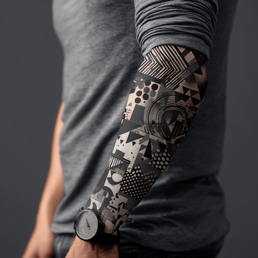
Abstract Tattoo Sleeves: Tiling Stencils For Wrap And Joint Flow
I map the limb first and mark principal joints so the pattern wraps and respects joint flow. I place tiling stencils along the limb direction so the repeat follows muscle lines and movement. I adjust stencil scale by 10% to 30% per segment when the arm narrows or widens so repeat rhythm stays consistent. I rotate tiles in 15 degree increments when the skin twist demands angular alignment so edges meet without distortion. I overlap tiles by 5 mm to 10 mm to prevent gaps when the client moves so seams read as intentional texture.
- Layout planning: I draw the primary axis and secondary flow lines for wrap and joint flow.
- Stencil sizing: I set base tile width and height then scale tiles per segment.
- Seam handling: I create micro-edges that interlock then blend at joints.
- Negative space: I reserve 10% to 25% of the sleeve area for breathing room so the design avoids visual clutter.
- Line weight: I match stroke widths across tiles so wrap reads as one continuous piece.
I test stencils on a mock arm or temporary transfers to verify wrap and joint flow before tattooing. I photograph the mockup at 0°, 45°, and 90° of flex so I capture movement artifacts and adjust tiles accordingly. I document tile sizes and rotation values in millimeters and degrees so replication stays precise across sessions.
| Parameter | Typical Range | Purpose |
|---|---|---|
| Tile scale change | 10%–30% | Match limb taper |
| Overlap | 5–10 mm | Prevent gaps |
| Reserved negative space | 10%–25% | Maintain readability |
| Rotation step | 15° | Align with skin twist |
| Photo angles | 0°, 45°, 90° | Verify joint flow |
I prioritize transitions at elbows and shoulders by designing joint tiles that read as partial motifs so the eye follows the wrap. I simplify high-contrast details near joints so movement doesn’t break the composition. I use texture tiles for continuity then introduce focal tiles for visual anchors so the sleeve reads both up close and at distance.
I archive each tile set with vector files and labeled stencil sheets so future sessions match the original wrap and joint flow. I communicate placement and flex tests to the client then request active movement to ensure the Abstract Tattoo Design Sleeves remain cohesive during daily use.
Understanding Abstract Tattoo Sleeve Design Principles
I outline core principles that make abstract tattoo sleeves read as unified wraps that move with the body. I focus on joint flow negative space and rhythmic tiling for clean repeatable results.
What Is Joint Flow And Why It Matters
I define joint flow as the directional movement of a design across joints so patterns remain continuous when the limb flexes. I map principal joints first and mark axis lines second so tiles align with natural skin twists. I test stencil rotation in 15° increments and adjust tile scale by 10% to 30% per limb segment so rhythm stays consistent. I overlap tiles where joints compress so gaps vanish during movement. I design guide tiles that lead the eye across elbow and shoulder transitions so the sleeve reads as a single surface.
Practical steps
- Map the limb using reference points such as wrist elbow and shoulder.
- Mark axis lines parallel to muscle direction.
- Scale tiles by 10% to 30% per segment to maintain pattern rhythm.
- Rotate tiles in 15° steps to match skin twist at joints.
- Overlap tiles at flex points to prevent visible gaps.
The Role Of Negative Space And Rhythm
I treat negative space as a structural element that separates motifs and prevents visual clutter. I reserve 10% to 30% negative space in high-detail zones and 40% to 60% in rest zones so contrast reads well at a distance. I set a repeating rhythm by varying tile density every 2 to 4 inches so the sleeve breathes and avoids monotony. I use texture tiles for continuity when dense motifs meet open skin so transitions feel intentional. I document tile sizes and negative space ratios in a template so replication and scaling stay precise.
- Reserve 10% to 30% negative space in dense areas.
- Reserve 40% to 60% negative space in open areas.
- Vary tile density every 2 to 4 inches for rhythm.
- Add texture tiles at boundaries to blend dense and open zones.
- Record tile sizes and negative space ratios for templates.
Tiling Stencils: Concepts And Benefits
I state the core concept and benefits of tiling stencils for wrap and joint flow in abstract tattoo sleeves. I focus on how tiled patterns maintain continuity across skin twists and joints.
How Tiling Stencils Create Seamless Wraps
- Map the limb using fixed reference points, then place tiles so major seams align with those points.
- Rotate tiles in consistent increments, then orient tiles to follow muscle and skin twists.
- Scale tiles by set percentages, then keep rhythm by changing size between segments.
- Overlap tiles at edges, then prevent gaps during flexion and extension.
- Reserve negative space as structural breaks, then avoid visual clutter in high-detail zones.
- Table of common parameter ranges
| Parameter | Typical value |
|---|---|
| Tile scale adjustment | 10%–30% |
| Rotation increment | 15° |
| Overlap margin | 3–8 mm |
| Negative space ratio (high detail) | 20%–35% |
| Negative space ratio (open areas) | 35%–60% |
| Density variation interval | 2–4 in |
Advantages For Artists And Clients
- Save time by reusing validated tile sets, then maintain consistency across multi-session projects.
- Reduce guesswork by documenting scale and rotation, then speed stencil placement in the studio.
- Improve client comfort by planning joint flow, then avoid dense ink over high-tension zones.
- Ensure visual cohesion by balancing motif rhythm, then prevent abrupt pattern breaks at joints.
- Preserve long-term aesthetics by reserving negative space, then limit future touch-up needs.
Designing For Wrap And Joint Flow
I map the limb before I draft tiles. I test motifs on extended and flexed references.
Mapping The Body And Identifying Landmarks
- I photograph the limb at neutral, flexed, and extended poses.
- I measure circumferences at 2 to 4 inch intervals along the limb.
- I mark fixed landmarks: acromion, deltoid insertion, lateral epicondyle, olecranon, radial and ulnar styloids.
- I draw axis lines parallel to major muscle directions and skin tension lines.
- I place principal seams on flatter planes, and I avoid placing seams on deep crease lines.
- I note rotation vectors where skin twists, and I record them as degree offsets for tile alignment.
- I document all marks on a template, and I archive photos and the template for replication.
Creating Repeatable Motifs That Bend With Anatomy
- I design motifs that tessellate without visible edges.
- I vary tile scale by 10% to 30% across segments to preserve rhythm.
- I rotate tiles in 15 degree increments to match local twist.
- I overlap adjacent tiles by 5% to 15% of tile width to prevent gaps when the limb flexes.
- I reserve negative space at a 20% ratio in high-detail zones and 35% in open zones to preserve legibility.
- I test motifs on photographed flexed poses, and I adjust scale or rotation if seams distort.
- I label tile sets with scale, rotation, overlap, and negative-space values, and I save them in a versioned archive.
| Parameter | Typical Range |
|---|---|
| Tile scale adjustment per segment | 10%–30% |
| Tile rotation increments | 15° |
| Overlap margin | 5%–15% |
| Negative space ratio (high-detail) | 20% |
| Negative space ratio (open areas) | 35% |
I rehearse stencil placement on a skin-safe transfer paper before the session.
I communicate planned seams and negative space with the client, and I show flexion tests so expectations match outcome.
Technical Tips For Stenciling And Application
I outline practical adjustments and hands on techniques for tiling stencils on abstract tattoo sleeves. I keep focus on scale overlap and transfer methods that preserve wrap and joint flow.
Scaling, Overlapping, And Edge Matching
I scale tiles by 10% to 30% per limb segment to keep rhythm across tapering areas. I rotate tiles in 15 degree increments to match skin twists. I overlap tiles by 5 mm to 10 mm to avoid gaps during flexion. I reserve negative space at a ratio of 1:3 in high detail zones and 1:6 in open zones to prevent visual clutter.
- Mapping reference points: I mark fixed anchors such as wrist crease elbow pit and shoulder cap to align tile seams.
- Axis alignment: I draw axis lines parallel to muscle direction to guide tile rotation.
- Edge matching: I trim tile edges with a soft bevel when seams hit joints so motifs read continuous.
- Scale testing: I print a 2 inch sample tile and wrap it on the limb to confirm perceived rhythm.
Parameter table for quick reference
| Parameter | Typical Range | Example |
|---|---|---|
| Tile scale adjustment | 10%–30% | 15% per forearm segment |
| Rotation increment | 15° | 30° on elbow twist |
| Overlap margin | 5 mm–10 mm | 7 mm at joint seams |
| Negative space ratio | 1:3 to 1:6 | 1:4 around biceps |
I document exact tile sizes and overlap values in my stencil log so I reproduce successful layouts.
Transfer Techniques For Curved Surfaces
I use skin safe transfer paper and rehearse placement on flexed poses before application. I photograph the limb in neutral flex and full flex to compare stencil fit. I measure circumference every 2 inches from joint to joint and note variance. I cut stencils in panels sized to follow natural folds instead of using one large sheet.
- Adhesion method: I apply transfer gel evenly in a thin layer then press stencil panel from one edge to the other.
- Panel sequencing: I start at a fixed anchor and work outward to avoid misalignment.
- Stretch control: I hold the skin taut in the primary axis while applying the panel then release to check joint flow.
- Touch up: I redraw critical seams freehand with a sterile marker when minor breaks appear.
I follow hygiene and safety guidance from tattoo professional bodies when using transfer products. Sources: Society of Permanent Cosmetic Professionals for transfer best practices.
Styling Options And Visual Directions
I describe styling options that preserve wrap and joint flow. I focus on clear choices that map to body movement.
Geometric Versus Organic Abstract Patterns
I pick geometric patterns when I want repeatable rhythm and precise edge matching. Geometric tiles use grids, tessellations, and radial modules. I scale geometric tiles by 10% to 30% per limb segment to keep rhythm when the limb narrows or widens. I rotate tiles in 15° increments to match skin twists.
I pick organic patterns when I want fluid continuity across joints. Organic tiles use flowing strokes, irregular negative space, and texture blends. I vary tile density every 2 to 4 inches to create breathing room and to guide the eye across a shoulder or elbow. I overlap organic tiles by 5 mm to 12 mm where skin folds compress, if the client flexes frequently.
- I mark axis lines first. (verb)
- I test tile repeat on a flexed limb second. (verb)
- I archive successful tile rotations third. (verb)
Using Color, Texture, And Line Weight
I use color to define planes and to enhance wrap perception. I limit palette sets to 2 to 4 hues per sleeve to avoid visual clutter. I reserve one neutral hue for negative space and one accent hue for focal tiles. I use lower saturation near joints to keep contrast readable when skin creases.
I use texture tiles to bridge transitions between dense and open areas. Texture examples include stipple clusters, fine crosshatch, and soft gradients. I match texture scale to tile scale so grain reads at 12 to 18 inches viewing distance.
I set line weight to support joint flow. I use the following quick reference when I plan inks and needles:
| Element | Recommended value |
|---|---|
| Primary contour line weight | 0.5 mm to 1.2 mm |
| Secondary lines and details | 0.15 mm to 0.4 mm |
| Texture mark size | 0.3 mm to 1.0 mm |
| Negative space ratio in high-detail zones | 25% |
| Negative space ratio in open zones | 40% |
- I increase line weight near anchors. (verb)
- I reduce line weight across flex points. (verb)
- I test color contrast under natural light. (verb)
I document color codes and needle groupings to ensure repeatability when I transfer stencils or when another artist continues the work. I follow skin-safety resources from dermatology literature when I select pigments, if a client reports sensitivity.
Case Studies And Portfolio Examples
I present real sleeve projects to show tiling stencils and wrap and joint flow in practice. Each case links design choices to measurable stencil parameters.
Before And After: From Concept To Completed Sleeve
- I mapped limb axis lines then marked joints to preserve joint flow.
- I scaled tiles by 10% to 30% per segment then rotated tiles in 15° increments to match skin twist.
- I overlapped adjacent tiles by 5 mm to 12 mm to prevent gaps during movement.
- I reserved negative space at ratios listed below to balance detail and rest.
Tile and negative space parameters
| Parameter | Low detail areas | High detail areas |
|---|---|---|
| Tile scale change per segment | 10% | 30% |
| Rotation increments | 15° | 15° |
| Overlap margin | 5 mm | 12 mm |
| Negative space ratio | 40% | 20% |
| Repeat density distance | 2 in | 4 in |
Portfolio examples
- Concept sketch series 01: Abstract Tattoo Sleeves mapping examples.
- Stencil set 02: Tiling Stencils edge match examples.
- Finished sleeve 03: Wrap and Joint Flow continuity examples.
I documented each project with photos before transfer and after healing at 3 months. I archived tile sets and transfer notes for replication.
Troubleshooting Common Flow Problems
Measure limb circumference again when tiles warp on curved surfaces.
Mark axis lines parallel to muscle direction when joint flow breaks at flexion.
Scale tiles up 10% when pattern appears compressed at the shoulder.
Rotate tiles in 15° increments when skin twist misaligns repeat motifs.
Overlap tiles more than 12 mm when gaps appear at the elbow during movement.
Reserve more negative space when tattoos read cluttered at rest.
- Reapply transfer gel evenly then reprint stencil when edge matching fails.
- Rehearse stencil placement on flexed poses then transfer with minimal skin stretch when continuity fails.
- Use skin safe transfer paper and follow standard hygiene guidelines then document product batch and date when repeatability matters (DermNet NZ) (Alliance of Professional Tattooists).
Best Practices For Collaboration With Clients
I clarify placement and movement expectations early. I set realistic timelines and document decisions.
Communicating Placement And Movement Expectations
I map the limb with the client while the limb is both relaxed and flexed. I mark principal joints and axis lines so the client sees where design flow matters. I show scale variations of 10% to 30% per segment so the client understands rhythm changes. I rehearse stencil placement on flexed poses so the client can feel movement before final transfer. I photograph proposed wraps from three angles so the client can approve continuity across elbows and shoulders. I record agreed tile sizes and negative space ratios so future touch ups match the original intent.
Aftercare Considerations For Complex Wraps
I explain that complex wraps need longer monitoring than single motifs. I give written aftercare that follows NHS guidance for tattoos (https://www.nhs.uk/conditions/tattoos/). I recommend 48 to 72 hour initial inspections and weekly progress checks for the first 4 weeks. I advise on moisturizers and sunscreens and name specific product types such as fragrance free emollients and SPF 30 plus sunscreens to reduce pigment loss. I schedule a touch up at 8 to 12 weeks to correct minor continuity shifts that occur with healing. I document any deviations during healing so future sleeves reuse the same tile set precisely.
Conclusion
Designing abstract tattoo sleeves is a practice of craft and intuition. I encourage you to experiment with tile rhythm and joint flow while staying mindful of skin movement. Practice with mockups and short sessions to build confidence and refine your eye.
Keep safety and clear client communication at the center of every project. Document what works and what needs tweaking so each sleeve feels more intentional than the last. Share your results and learn from other artists to keep evolving your approach.
Frequently Asked Questions
What is an abstract tattoo sleeve?
An abstract tattoo sleeve is a cohesive collection of non-representational patterns and motifs wrapped around the arm or leg, designed to move with the body and create a unified visual wrap rather than discrete images.
What does “joint flow” mean?
Joint flow is the directional continuity of a design across joints (elbow, shoulder, knee) so patterns remain seamless and readable when the limb flexes or twists.
What are tiling stencils and why use them?
Tiling stencils are repeatable pattern tiles used to build larger wraps. They ensure rhythm, edge matching, and consistency across complex curved surfaces for efficient, repeatable results.
How much should I scale tiles between segments?
Adjust tile scale by roughly 10%–30% per limb segment to maintain rhythm and proportion relative to changing circumferences and muscle shapes.
How should tiles be rotated?
Rotate tiles in small increments—typically 15-degree steps—to align patterns with skin twists and muscle direction, preserving visual flow during movement.
How much overlap is needed between tiles?
Use overlap margins of about 10%–20% of tile width to prevent gaps when the skin moves and to allow clean edge matching across seams.
What role does negative space play?
Negative space separates motifs, prevents clutter, and defines rhythm. Aim for higher negative-space ratios in detailed areas and lower in simpler stretches to balance clarity.
How do you map a limb for a sleeve?
Map the limb by marking landmarks and principal joints, drawing axis lines parallel to muscle direction, and dividing into segments for tile and scale planning.
How do you transfer stencils onto curved skin?
Measure circumference, rehearse placement on flexed poses, apply transfer gel evenly, control skin stretch during application, and use skin-safe transfer paper for best adhesion.
What hygiene and safety steps are essential?
Use sterile transfer products, single-use paper, gloves, clean work surfaces, and follow standard tattoo aftercare protocols to minimize infection risk and ensure safe healing.
How do color, texture, and line weight affect joint flow?
Color palettes, texture scale, and line weight should support continuity: consistent line weights, complementary palettes, and textures sized to the limb maintain readability across joints.
What are common continuity problems and fixes?
Common issues: tile warping, misaligned edges, and gaps. Fixes include increasing overlap, adjusting scale/rotation, re-matching edges, and reapplying stencils on flexed positions.
How should artists document parameters for replication?
Record tile sizes, scale percentages, rotation increments, overlap margins, and negative-space ratios; archive tile sets and photo-reference of stencil placement for precise replication.
How do you collaborate with clients on complex wraps?
Map the limb with the client, show scale variations and rehearsal placements, discuss movement expectations, and schedule touch-ups to ensure satisfaction during healing.
What aftercare is recommended for tiled abstract sleeves?
Recommend longer monitoring, gentle cleansing, specific healing balms, avoid excessive stretch during healing, and plan touch-ups to restore continuity once healed.